As far as each entry's footprint goes, these are the smallest entries when viewed in person. A single miniature occupies a relatively tiny base, and sometimes the model itself is only about an inch tall. There are larger models within the single miniature catagory (ones mounted on steeds, typically), but anything larger would be considered for the large model catagory.
*Side note: We're considering making a template for next year and keeping it on hand at the entry table, in order to eliminate any confusion. If your entry cannot fit within the single miniature template, then it must be entered into the large model catagory. And since each participant can only enter a maximum of one entry per catagory, it may mean that you would have to choose between your intended single miniature entry (that happened to be too big) and your intended large model entry, as your sole entry for the large model catagory.
Since these entries are the smallest of the three catagories, they require the viewing public to get pretty darn close to the cases to discern the level of work that went into each one. As many people don't bother to get that close, or perhaps don't have the sharpest eyesight (I certainly don't... hence my increasing reliance on an optivisor for judging), the single models are often the most overlooked. Not only that, but when people come check out which ones actually won, they are often suprised by the judge's decisions.
Of course, with the wonders of digital photography, the Internet, and giant size monitors, the amount of detail crammed into these tiny models becomes more easily apparent after the event is over. Certain elements pop, and subtleties can be better appreciated.
Single model catagories are also usually the most heavily contested. After all, EVERYONE has a bunch of single models painted up. They might not have a cohesive unit of painted models, or they may not have taken the time to paint up a large model like a dragon or tank, but everyone has a few individual models painted up that they are proud of.
So while the large models often get the lions share of Con-goers attention ("Ooh, look! A big dragon / stompy robot! How cool!"), followed by units, single miniatures take a more discerning eye to really appreciate, and to stand out from the hordes of other single miniatures.
Well, let's get into it, why don't we?

Arthur Nicholson's stunning Kingdom Death Architect model (pinup version). This model was a textbook definition of "overlooked". In the case, this petite miniature didn't have any features that really made it stand out (other than the, uh, um... what was I talking about again?). No fiery daemonic steed, no huge banner, no huge guns (although Austin Powers fans might beg to differ), and no crazy, over-the-top base. Just an amazing job of buttery smooth blending, plenty of contrast, and Arthur's trademark impeccable brushwork. His technical proficiency is astounding. Have a look at her backside... er... I mean, the back of the model:

The highlights and shading on the skin is absolutely seamless. No rough spots, no visible brushstrokes, no Playboy magazine style airbrushing either. Just a deft hand with the brush, and an ungodly ability to blend paints. This can also be witnessed on the weapon she carries. Unless you zoom in really close, you can't discern the layers of blending at all (and remember, the model is only about an inch tall in real life... many times smaller than what you're seeing on screen).
That being said, I can't say that this model was perfect. For one, the face was darker than the rest of the model's skin. That's something of a big faux pas in miniature painting, and in other kinds of art as well. In real life, our brains are somehow hard-wired to gravitate to people's faces... it's usually the fastest way to recognize people. In order to simulate this effect on a 2d art piece, or a 3d miniature, we have to brighten up the face in comparison to the rest of the model. By doing so, you draw the eyes to your subject's eyes and face, and then it can wander out from there.
Another thing to consider is that the face is the first place our eyes want to look at in order to determine the mood of the model. Facial expressions convey emotion and tone better than anything else, and so naturally, we need to find the face first in order to understand the rest of the model.
Another thing to consider is that the face is the first place our eyes want to look at in order to determine the mood of the model. Facial expressions convey emotion and tone better than anything else, and so naturally, we need to find the face first in order to understand the rest of the model.
In old school cartoon art, they used to exaggerate the head size quite a bit, as they didn't have sophisticated enough printing technology to make the face brighter (in fact, it was often only in black and white print):
 |
And in fantasy art, the composition and lighting of a piece is designed in such a way as to draw the viewer's eye toward the face first:
 |
And after watching a "behind the scenes" documentary of the filming of Lord of the Rings, I realized that even in movies, lighting is done to emphasize an actor's face, both during filming, and in post-production:
 |
Okay, so that last one wasn't in keeping with the pin-up theme (unless you have a thing for hobbits and wizards). But you get the idea.
Lastly, I would also have liked to see a bit more done with the base. Nothing over the top to distract the viewer from model itself, but a little more weathering, perhaps a teeny bit of vegetation, and perhaps some grime on the stone (ever notice how old stone and concrete always seems to have a thin sheen of green slime creeping up the side of it?) would have made the base look a bit less sterile.

Craig Fleming's Saurus Warrior on Cold One (or as he titled the piece, "Lizard riding a lizard"). This was also a pretty great piece, and was pretty ambitious. Great blends on the metal arm (plenty of contrast, but could have used a touch of blacklining and a little hit of edge highlighting simulating a glint of light to really make it pop), fantastic gleaming effect on the spear blade (notice how the dark areas meet up with the light areas on the opposite sloping side of the blade... that's the key to maximum contrast, and contrast is key to implied metallic shine), a nicely detailed base, and nice looking bone effects.
There's something about this model that looks clunky to me though. Perhaps it's the fact that the rider has about the same mass as the mount (no fault of the painter though, but nonetheless, picking a good piece to work on is a strong component of a successful painting contest entry), or perhaps it's because the rider and mount are fairly similar in colour and tone (using a complementary or contrasting colour scheme for the two would have visually separated them better). Compounding the last sin is the colours of the base... they also sit around the same colour spectrum. Up close, the model is fantastic. From arm's length, details get a bit muddled.
Excellent work overall though.

Ryan McKinnon's "Southlands Ogre" is a solid entry, with some really neat details. The dark skin is well executed, and fits the theme of the model nicely. So does the crackle effect on the base (dry, parched ground), and the bright tattoos / warpaint. The brightness of the markings are a bit uniform though... the fact that it's the same brightness of yellow and orange used on the zenith of the model (the top of the head and shoulders, where the sun's light would hit brightest) as the more shaded areas (under his shoulders and in the shadow of his "moobs") dispels any illusion of scale. However, I also really liked the verdigris effect on the bronze bits... it gives the metal parts a weathered look.
This is a great gaming piece, but a few extra minutes of work could have elevated it into a more serious competition level. The bronze could have used some more highlighting... even aged metal reflects a bit more light than this... a hint of a shiny glint here and there would have added extra interest. There is also only two tones of colour on the upper part of the footwear... I grant you that feet are hardly my favourite parts of a model either, and I tend to rush things a bit there too, but two tones is fairly flat. The skin could have used one more level of highlighting as well... nothing drastic, just a really restrained touch of a slightly lighter tone where the light would catch a bit more (tip of the nose, edge of the eyebrows, top of the head, off the points of his knuckles, etc).
Still, this model had plenty of character, and the more I look at it, the more things I find that I like. The highlighting of his facial hair is spot on, the trousers are nicely done, the teeth are particularly well shaded and highlighted too. Great work.

Gordon Henderson's "Battle Nun" had pop aplenty. The bright red robe, contrasted against the vibrant green base, made this model really stand out from it's competitors. The black shoes don't get lost in the raised foliage of the base, and grey / silver metallics give the model a decent amount of negative space, keeping things nice and simple.
Gordon could probably thin his paints a bit more though. Multiple coats of thinned down paint would make the model look a bit smoother. Also, a bit of blacklining would help define each area from one another... there's no discernible border between his reds and his whites, for example. A touch of blacklining would have helped around the eyes as well. Some deeper shading on the reds of her clothing would have helped define the creases and folds of the cloth too.
But Gordon's colour selection, and more importantly, his colour placement, was impeccable. I can tell that his technique will improve in time, but there's every indication of a good artistic eye in this model.
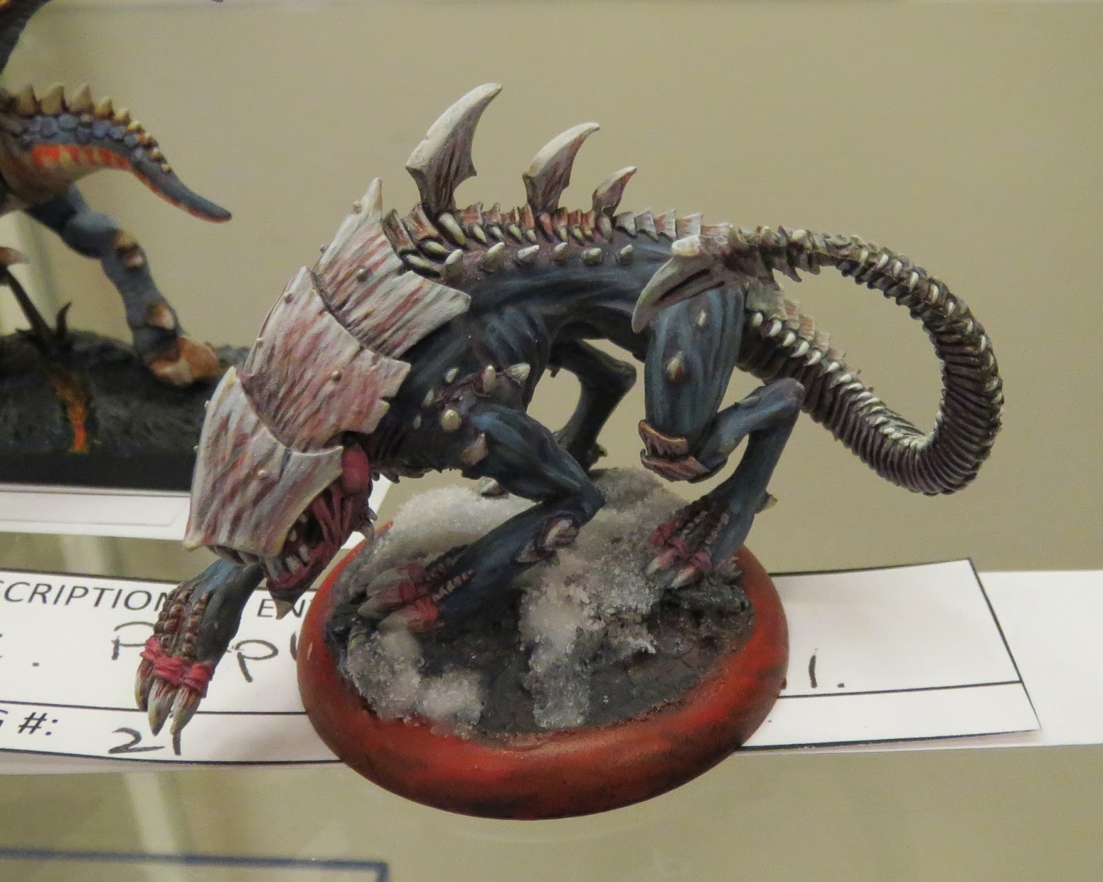
David Brereton's "Raek" was a dynamic entry in the single model catagory. The flesh coloured undertones / streaks in the chitin really give it an organic feel. His highlight placement was also good, although the brushstroke highlighting is a bit heavy handed. I get that it gives off a striated muscle impression, but it's a "quick and dirty" technique... it gets the job done, but it's not all that elegant. On the other hand, the model itself does not have particularly well defined muscles, so this may have been a conscious effort on David's part to make up for the shallow detail of the sculpt itself.
Nice touch with the use of crushed glass as snow. I've used the stuff myself (Secret Weapon Miniatures offers a particularly great set that I like), and there's certainly a bit of a learning curve involved. It has a gorgeous sparkle that other kinds of fake snow don't offer, but getting the right consistency takes practice, and the stuff is hazardous to use if you don't take precautions (a dust mask keeps you from inhaling glass particles, and latex gloves keeps the stuff from working it's way into your skin and under your nails). I think David might have tried applying the stuff all in one go... it came off as chunky slush, rather than fallen or disturbed snow. Perhaps thinning the stuff down with more water effects, and building it up in thin stages (letting each layer dry before adding the next) would have been better.
Overall, a great piece. Powerful and aggressive in tone, but it could have used slightly more refined techniques for my tastes.

Apologies to Rob Howell for the particularly bad photo of his Trollblood Solo. All these pics were taken by my humble little compact Canon Elph (I simply didn't have the space in my gear bag to carry all my painting clinic supplies AND a full size DSLR and specialized lighting), and the poor little thing just had a horrific time trying to capture this particular model.
But bad photography aside, there was nothing horrific about this model. Skin tones were awesome, colour selection was great (the subdued tones in her clothing really made her turquoise skin pop in contrast), and the extra details in the base were really nice. The face, chest, and shoulders were the main attraction though... really smooth highlighting and shading added to the realism, and the lighting was done well too. The rest of the model could have used an extra layer of highlighting to really help define the details though... Rob really got the foundational highlights and shading down well, but an edge highlight here and there would have given them a crisp finish that would have made everything stand out better, and help the viewer's eye read the model. The brown leather straps in particular could have used one or two more levels of highlighting... perhaps mixing in a touch of bone paint into the brown would have simulated the reflection of light a bit. Even the metal areas could have used a touch of edge highlighting to give the impression of light glinting off a shiny surface.
Overall, I can say that this paintjob was definately headed in the right direction. However, it seemed to stop just shy of it's final destination.
I'm going to pack it in for tonight (gotta get up early to coach my kid's soccer game tomorrow morning). I've got several more entries to cover in just the Single Miniature catagory, and then on to the large model catagory and the group / unit catagory. Keep checking back, and as always, comments are always welcome.
There's something about this model that looks clunky to me though. Perhaps it's the fact that the rider has about the same mass as the mount (no fault of the painter though, but nonetheless, picking a good piece to work on is a strong component of a successful painting contest entry), or perhaps it's because the rider and mount are fairly similar in colour and tone (using a complementary or contrasting colour scheme for the two would have visually separated them better). Compounding the last sin is the colours of the base... they also sit around the same colour spectrum. Up close, the model is fantastic. From arm's length, details get a bit muddled.
Excellent work overall though.
Ryan McKinnon's "Southlands Ogre" is a solid entry, with some really neat details. The dark skin is well executed, and fits the theme of the model nicely. So does the crackle effect on the base (dry, parched ground), and the bright tattoos / warpaint. The brightness of the markings are a bit uniform though... the fact that it's the same brightness of yellow and orange used on the zenith of the model (the top of the head and shoulders, where the sun's light would hit brightest) as the more shaded areas (under his shoulders and in the shadow of his "moobs") dispels any illusion of scale. However, I also really liked the verdigris effect on the bronze bits... it gives the metal parts a weathered look.
This is a great gaming piece, but a few extra minutes of work could have elevated it into a more serious competition level. The bronze could have used some more highlighting... even aged metal reflects a bit more light than this... a hint of a shiny glint here and there would have added extra interest. There is also only two tones of colour on the upper part of the footwear... I grant you that feet are hardly my favourite parts of a model either, and I tend to rush things a bit there too, but two tones is fairly flat. The skin could have used one more level of highlighting as well... nothing drastic, just a really restrained touch of a slightly lighter tone where the light would catch a bit more (tip of the nose, edge of the eyebrows, top of the head, off the points of his knuckles, etc).
Still, this model had plenty of character, and the more I look at it, the more things I find that I like. The highlighting of his facial hair is spot on, the trousers are nicely done, the teeth are particularly well shaded and highlighted too. Great work.
Gordon Henderson's "Battle Nun" had pop aplenty. The bright red robe, contrasted against the vibrant green base, made this model really stand out from it's competitors. The black shoes don't get lost in the raised foliage of the base, and grey / silver metallics give the model a decent amount of negative space, keeping things nice and simple.
Gordon could probably thin his paints a bit more though. Multiple coats of thinned down paint would make the model look a bit smoother. Also, a bit of blacklining would help define each area from one another... there's no discernible border between his reds and his whites, for example. A touch of blacklining would have helped around the eyes as well. Some deeper shading on the reds of her clothing would have helped define the creases and folds of the cloth too.
But Gordon's colour selection, and more importantly, his colour placement, was impeccable. I can tell that his technique will improve in time, but there's every indication of a good artistic eye in this model.
David Brereton's "Raek" was a dynamic entry in the single model catagory. The flesh coloured undertones / streaks in the chitin really give it an organic feel. His highlight placement was also good, although the brushstroke highlighting is a bit heavy handed. I get that it gives off a striated muscle impression, but it's a "quick and dirty" technique... it gets the job done, but it's not all that elegant. On the other hand, the model itself does not have particularly well defined muscles, so this may have been a conscious effort on David's part to make up for the shallow detail of the sculpt itself.
Nice touch with the use of crushed glass as snow. I've used the stuff myself (Secret Weapon Miniatures offers a particularly great set that I like), and there's certainly a bit of a learning curve involved. It has a gorgeous sparkle that other kinds of fake snow don't offer, but getting the right consistency takes practice, and the stuff is hazardous to use if you don't take precautions (a dust mask keeps you from inhaling glass particles, and latex gloves keeps the stuff from working it's way into your skin and under your nails). I think David might have tried applying the stuff all in one go... it came off as chunky slush, rather than fallen or disturbed snow. Perhaps thinning the stuff down with more water effects, and building it up in thin stages (letting each layer dry before adding the next) would have been better.
Overall, a great piece. Powerful and aggressive in tone, but it could have used slightly more refined techniques for my tastes.
Apologies to Rob Howell for the particularly bad photo of his Trollblood Solo. All these pics were taken by my humble little compact Canon Elph (I simply didn't have the space in my gear bag to carry all my painting clinic supplies AND a full size DSLR and specialized lighting), and the poor little thing just had a horrific time trying to capture this particular model.
But bad photography aside, there was nothing horrific about this model. Skin tones were awesome, colour selection was great (the subdued tones in her clothing really made her turquoise skin pop in contrast), and the extra details in the base were really nice. The face, chest, and shoulders were the main attraction though... really smooth highlighting and shading added to the realism, and the lighting was done well too. The rest of the model could have used an extra layer of highlighting to really help define the details though... Rob really got the foundational highlights and shading down well, but an edge highlight here and there would have given them a crisp finish that would have made everything stand out better, and help the viewer's eye read the model. The brown leather straps in particular could have used one or two more levels of highlighting... perhaps mixing in a touch of bone paint into the brown would have simulated the reflection of light a bit. Even the metal areas could have used a touch of edge highlighting to give the impression of light glinting off a shiny surface.
Overall, I can say that this paintjob was definately headed in the right direction. However, it seemed to stop just shy of it's final destination.
I'm going to pack it in for tonight (gotta get up early to coach my kid's soccer game tomorrow morning). I've got several more entries to cover in just the Single Miniature catagory, and then on to the large model catagory and the group / unit catagory. Keep checking back, and as always, comments are always welcome.
I assumed this would just be writing about the winners - imagine my surprise to see my lizard on lizard! This was a great read (speaking of ambitious - this is going to be a long series! :)) and I'm looking forward to the rest of the series!
ReplyDeleteYou mention that some blacklining and edge highlighting on the metallic arm would help - could I ask for more specifics about where to place each of these effects? I'm afraid that I wasn't super happy with the NMM effect once I was finished, but I had no real idea how to finish it to make it work!
Some more and closer photos of this model (along with a plug for my own painting blog :P) can be found...http://geeksong.com/pigment.apply/?p=1568
Yup, the GottaCon coverage is going to take awhile, but I hope it'll be worth it for everyone involved. Even when discussing a model that one might not have noticed during the competition, I plan on bringing up points that will hopefully help other painters out there as well.
ReplyDeleteThe main thing about simulating "shine" when using matt finished paints is to maximize contrast. As far as NMM goes, that means taking your colour all the way to black at one end, and all the way to white on the other. Now, while doing so, you need to be hyper aware of placement of colour... blacks will meet whites for the ultimate in contrast.
So, for your metal arm, take the shading all the way to black, and the next component would start at white, and then go down through your colour (grey in this case) all the way to black again.
Your blued blade is a good example of this. What gives it that reflective mirror-like finish is the fact that the half of the blade that has gone to black matches up precisely with the brightest spots on the opposite sloping half of the blade, just on the other side of the blade's spine. And vice versa, of course.
One odd trick with pewter models that I've tried (with some success, although it hasn't worked out 100% of the time) is to give the model a bit of a polish before primering... I've heard of people using really fine buffing agents, but I've had some success with an old toothbrush and toothpaste. It gets a somewhat reflective finish, and then I place it under a light (making sure the light is coming from the direction that I want to imply... high and to one side if sun, otherwise from some directed OSL light source). I then take some digital pics, and later I can use those pics for quick reference once I get to the painting stage.
Of course, I can't claim to be a master of NMM by any stretch of the imagination. I rather like how Mathieu Fontaine does TMM, and have been pushing myself in that direction. However, the two do have some similarities in execution... the difference is mainly in what mediums are used (NMM uses matt finish coloured paints, and TMM uses metallic paints for the base and highlights, and matt finished blacks / browns / dark colours for the shading). If you really want to learn NMM, there are a number of places to look online, and then you've really got to invest some serious time practicing them. Overall though, I think you got off to a really good start.